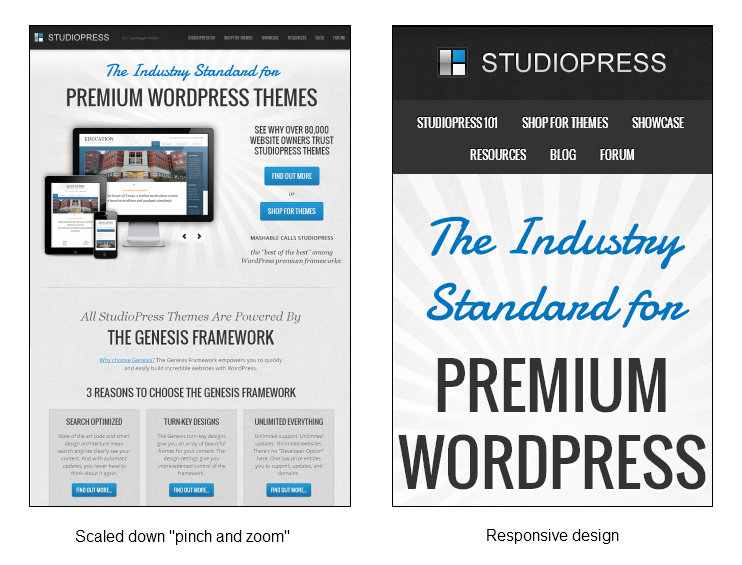
Mobile devices like iPhones, iPads, and android devices have become very popular over the last couple of years. This popularity has fueled discussions for “responsive” theme design. This basically means that your theme changes based on the size of the screen your viewer is using. Most phones allow you to view a site and “pinch and zoom” to be able to navigate around it but when someone is out on the town this pinching and zooming isn’t the best option to help them find your business or make a choice about where they are going. Responsive themes actually move the content of the site around allowing you to interact more easily on a smaller screen. Let me give you an example with some images:

Do you see how the navigation menu will be much easier to use on the responsive version? As I scroll down I still see the same content but I can read it easier on my phone because of the layout:
Do you see how a responsive design automatically changes the layout to match the design of your website? This is awesome because your user is able to more easily find and read the content on your website no matter how they get to your site.
Creating a Responsive WordPress Theme
The actual process of creating a responsive theme has two parts. Unlike a standard website design where you draw it up and build it out, you need to look at the content “blocks” on the website and different ways to lay them out. You basically have to look at the layout of the website and design 3 or 4 different versions of the site to see how you will move the content around. The second part is actually taking those designs and making the layout respond based on the viewable area of the website. This can get tedious as you look at different widths of the design and find ways to shift content around that make it look great. When every anything can be difficult you can often interpret that as costly. But don’t fret too much if your website isn’t responsive or you are looking to build a responsive website.
Because WordPress is awesome and most themes use “widget” areas and this basically creates those “blocks” of content that get shifted around which means responsive WordPress themes are widely available. Since you can easily switch themes this task becomes much less complicated and costly if you have a theme that someone has already created as responsive.
Mobile Responsive Design is The Future of The Web
Responsive website design is about delivering the content to your audience the way they want in a way they can easily view it.
This is amazing for small business owners because responsive design eliminates the need for multiple versions of your site or even hiring a developer to build an expensive app for your business. You no longer need an “app” because your website does what the app would (minus all the development and maintenance costs.) You have one website with multiple versions.
If you don’t know what your website looks like on mobile devices, you can test it on this responsive layout test page. (Just plug in your business website url in the box and it will show you what your website looks like.)
You don’t have to build your own responsive theme, the team at StudioPress have already done the work for you for lots of their themes and they are updating the rest of them to be responsive too. Check out these Responsive WordPress themes designed on the Genesis framework. (Genesis is my favorite framework to work with!)


Leave a Reply